Monday, July 26, 2010

peony petals finished

untitled 'petals', coloured pencil on Stonehenge, 22.5" x 6.5"

While the piece still doesn't have a title, it is for the most part done. I will no doubt go back in and tweak some values before it is framed. Maybe I'll call it Peony Clouds - it reminds me a bit of how clouds look from an airplane! :-) While a peony was my inspiration, I deviated from reality by making the petals a lot more multicoloured and by stylizing the various veins and shapes. I have included a more detailed shot of a section of the piece below.


I won't be in the studio this week because I am heading off to California! I am attending the Coloured Pencil Society of America's convention. I shall also be able to see the CPSA exhibition. Woo-hoo!! The CPSA's 18th Annual International Exhibition is now open for viewing at the Art Museum of Los Gatos. If you are visiting the San Francisco area this summer do take the opportunity to visit this incredible exhibition - all of the work juried into the show has been executed exclusively in coloured pencil!

Now I must confess that two of the aspects of being an artist that I truly love are the quiet and solitude that this lifestyle affords. So...traveling across the USA and spending time in crowded airports is for me an experience right up there with dental surgery!

Ah, but I am looking forward to seeing the exhibition. (Seeing the art submitted for the silent auction is like seeing a second cp exhibition!) And as I discovered at last year's convention in Atlanta, coloured pencil artists are definitely some of the nicest people you could ever know! I am also excited to be attending a workshop on Thursday. The instructor for the workshop is Ester Roi, the inventor of the Icarus Drawing Board. Ester shall be sharing her techniques in working with waxed based media and heat. Ester's work is amazing and I look forward to experimenting with this new way of working. So California, here I come! :-)

Ah, but how could I leave this little guy? He is our three month old bundle of goat cuteness. Fortunately, all of the critters with fur, hoofs and feathers shall be in the capable care of my husband. Guess he will be glad to see me return! :-)

Friday, July 9, 2010

'Petals' wip, farm life pics

Untitled WIP, part of 'petals' series, cps on Stonehenge, 22.5" x 6.5"
copyright Teresa Mallen

Here is what is currently on my drafting table. This photo was taken last week and the piece is further along now. Actually it is almost finished so I shall be able to post the final image next week.

After having finishing a couple of large abstract-ish pieces on sanded pastel paper, I wanted a change. I have been busy in the studio these many weeks (since my last post) exploring and messing about. I did some acrylic paintings, just small studies really and a bit of mixed media work. I didn't end up with anything I wanted to reveal as works in progress. I was just stretching myself in new directions for a wee bit. I am the first to admit that painting with acrylics is not my forte but I do enjoy giving it a go. The enjoyment is very brief and in no time I am disappointed with my results and frustrated with the medium. I am always delighted to return to my cps!

Once I was back using coloured pencils, I started working on a painting inspired by the Solomon's Seal that was blooming in my garden. I was working small, something like 8 x 10 inches, on Colourfix paper. Once I got into the piece, I started to regret my choice of surface as well as the colour of the paper. I knew it was time to switch to white paper and one with a lot less tooth. So the Solomon's Seal piece was set aside. I might rework it another day...

My current 'petals' piece will end up becoming part of a series that I started last year featuring peony petals. For those of you who are familiar with my work, you might have noticed my return to one of my favourite formats, a juicy, long horizontal - 22.5 inches x 6.5 inches. Working on the white surface is allowing me to play with soft colour blending, something I so enjoy with the cp medium. I am really enjoying working on this piece!

When not in the studio, I have been very busy outdoors. Remember those 600 seedlings I started indoors in the winter months? Well, I got all of them planted as well as some veggies direct from seed. Here is a partial shot of my vegetable garden taken a few weeks ago. The plants have grown quite a bit since then. To give you an idea of size, I would guess that the garden is about 80 feet by 80 feet. We started this garden from scratch when we moved here and like my art it also is a work in progress. I hope to increase the size of it next year as there were veggies I wanted to plant that I just didn't have room for. We have an electric fence up to keep the deer out. We now have deer here everyday. One is a mom with twin fawns. They are so cute it is hard to get angry at mom's nightly munching in the flower beds.


I reported in my last post that baby chicks were coming. Here is a shot of them on the day they arrived.


Here is a pretty baby hen at three weeks. She now had some new feathers replacing her down.


Here is a picture of some of the chickens at 8 weeks. They are 10 weeks old now and are bigger than they are here. They are an absolute delight...okay their poop is stinky but once the bedding from their chicken house has been composted, it will make great fertilizer for the garden, so it is all good! :-)


The arrival of my two dairy goats was quite eventful! I grew up on a dairy farm and while our herd of cows was milked by machine, I did see both my mom and dad milk by hand many times. I have learned that milking by hand is quite a skill and it looks easier than it actually is. Getting milk out isn't too difficult but landing it in the pail is more of a challenge and gosh until your hands and arms develop all of the right muscles, hand cramps happen. Here I am milking Veesa.


And here is what it all comes down to, milk hitting the pail!


Here is my girl Rainah, giving her head a good rub. Rainah is a purebred Alpine. Her breed originates from the French alps and she has the breed's characteristic two toned markings.


I was surprised to find that my domestic goats like to rear up and butt heads like wild goats do. Here Rainah has jumped up onto higher ground to give her a bit of an advantage. Veesa is bigger though and could really clean her clock as it were if she chose to. Rainah reminds me of a little sister bugging her older sister. She starts all of the skirmishes. Veesa is a purebred Saanen and her breed is all white and orginates in the Swiss alps. Both of these girls had kids this spring (which is of course how I can milk them). Well, my gals were pining for their kiddies so I ended up returning them to the breeder to be with the kids. My husband and I are making some changes to the set up of our barn and we are doing some more fencing in the pasture. The girls will be back here in about two weeks and this time we shall be bringing their kids here too!


What with putting in the garden and learning how to make cheese (goat milk is awesome stuff - from yogurt to cottage cheese, to ice cream, mozzarella, ricotta, fresh chevre, on and on it goes) things in my half of our home office got out of control. That mess took some work. You might notice a painting on my desk. Well, it would seem that somehow, while we were framing all sorts of paintings for my studio tour last fall, we missed scanning this one. My husband and I both 'remember' seeing a scan but darned if we can find it in any file, on any computer. So...it had to be taken apart.

Taking apart a painting is a sad business. It is so much work to frame one that it seems a crime to have to undo all of that effort.

While I was at it, I took apart Neptune's Leaves too. It had been framed with glass last fall and I needed to frame it in acrylic so it could be shipped to California for the CPSA exhibition.

The backing paper is adhered using double sided tape. It is sticky stuff and not easy to remove fully. While new tape eventually ends up getting put down, I do try to remove as much of the residue as I can so that the fresh paper will lie down very smoothly.


I have also been up to my chair restoration fun. Some of you may recall the old chairs that I found in the attic of my parents' house. Here are two more that I am just getting around to dealing with. The rose one had just been washed (the dried old pigeon poop came off easily) and I ripped off the fabric from the other chair. At one time the back must have contained some homemade stuffing. I have refinished the wood work and the rose chair is now in my studio where it sits next to its mate (a green one that I refinished last year). I have found a place in a town near here where I can purchase a kit that contains everything I need to weave a new seat to mend the chair on the left. The chair is in excellent condition otherwise and once it has a new seat installed it shall be quite a wonderful addition to my collection. Of course finding spots for them in the house is another issue but goodness, they just couldn't go off to the landfill! :-)

What else has been going on? Well, I stained a deck table and two Adirondack chairs.

Major trimming of old lilac trees has taken place, rhubarb pies have been baked, and woo-hoo my raspberry bushes are producing well. The former owner had left a small wild patch in the corner of the rear yard. Raspberry bushes spread quickly if left alone to do their thing so after moving in, I have left them alone and let them spread. Yum, yum.

Humm
...my computer crashed and had to go off and get fixed. That was fun. Not.

Oh and I spent an afternoon in the USA this week. Some of you might know of my troubles last year getting my art to the CPSA exhibition in Atlanta. My shipment was delayed by US customs because of a mistake (theirs not mine) and it took some major expediting on my part to get my parcel released. This year, I did up my customs papers (stuff like NAFTA free trade declarations of original goods paperwork and Homeland Security forms) and I went across the border myself, clearing my package with the customs people in person. I traveled to the town of Ogdensburg (just across the border in upper New York State) and I shipped my parcel from there. It is on the way to California as I type. It has to arrive there next week and it shall. Whew!

Finally, while my chickens and goats are wonderful, I would be lost without Mr. Top Dog! Here is my fella with a 'find' on one of our local wilderness hikes - part of a deer leg. Oh doggie joy. Of course some other creature got the good stuff off of it but my guy proudly walked around with the leg for a while before hiding it in a clump of large juniper bushes. We returned there the following week and he fished it out for some more prancing.


Animals always remind me of the happiness found in simple pleasures. Whether it is my chickens clucking with delight at an unexpected treat of leftover rice, or my goats fighting over nacho chips or my dog living out his predator dreams, they bear witness to the truth that if we really embrace living in the present moment, enjoying the small gifts of each day, we can often find the pleasure and joy we seek. I hope you have all had a wonderful late spring and early summer. Anyone else been experiencing this heatwave? :-)

Monday, April 26, 2010

CPSA acceptance, signature status

Neptune's Leaves, Coloured Pencil on Colourfix Paper, 21 1/2"w x 16 1/2"h
Copyright Teresa Mallen

I am delighted to announce that Neptune's Leaves has been juried into the CPSA's 2010 International Exhibition. With this acceptance, I have earned my CPSA signature status! Of course my art has to actually hang in the show in order to fulfill the organization's requirements - acceptance isn't enough. Some of you might remember how last year my painting almost missed the shipping deadline because it was being held by customs officials. Yes, lightning does strike twice, but not real often, right?

The Colored Pencil Society of America's 18th Annual International Exhibition will take place at the Art Museum of Los Gatos California from July 22 until August 20th, 2010. For complete details and a list of the accepted artists, visit the CPSA website.

Congratulations to all of the other artists whose work has been juried into this prestigious coloured pencil exhibition!

And if this news wasn't exciting enough, I just made arrangements this morning to purchase two dairy goats. I shall be adding milk maid to my resume by the end of the week! Here is my husband with one of our ladies...oh and my flock of 25 day-old chicks arrives on Wednesday. Art, chickens and goats - life is very very good!


Tuesday, April 20, 2010

Finished Blue Blooded

Blue Blooded, Coloured Pencil on Colourfix Paper, 19" x 17" (48cm x 43cm)
Copyright Teresa Mallen

Here is a finished image of my funky Blue Blooded. The colours are brighter and more vivid in real life but this is the best photo I have at the moment. Until I worry about getting a good image for my website, this shall suffice. I have had this done for quite awhile but every time I wanted to take a photo, it was raining outside. I find this a spooky piece to have in the studio unframed. It looks so much like pastel that every time I move it from one spot to another, I keep expecting pastel pigment to fall off!

Things have been real exciting in the studio - I have been taking inventory. Woo-hoo. :-) I have gone through my pencils and I have shopped for ones that needed replacing. I even got out my superglue and glued pencil stubs to my new pencils. Now I realize that some cp artists think this is going over the top. Many just throw out their pencils when they shorten down so much that that they are impossible to hold on to or sharpen. Me, I like to glue. I find it works really well, they sharpen just fine in my electric sharpener and they look really cool when people visit your studio!


I attended a presentation last week by local watercolour artist Brian Seed. For readers who are watercolour artists, you might wish to check out the handprint website. Brian recommended it as a great resource for info. I had a look and it does seem like you could spend quite a bit of time there.

I always like seeing the work of coloured pencil artists. The April/May 2010 issue of International Artist featured several pages of cp art by Judith Burton. If you don't have a copy of the magazine, you can see Judith's work by visiting the pencil gallery on her website. (just click her name for the hyperlink)

Well yippee, my taxes are done. Now I am working on tweaking my website. In the studio, I have some pots of Colourfix primer (the same stuff that is applied to the surface of Colourfix sanded pastel paper) waiting to be applied to some birch panels that I have bought.

For those of you who have been reading for awhile, you will be well aware of all of my trips out of town to get the house when my parents had lived ready for sale. I am happy to report that much work has been done and the property has now been listed in real estate. That translates into more time in the studio for me. Finally. Oh and in the garden too. :-)

It is a beautiful spring here in Ottawa. Here are a few pics I took today.

Starting with daffodils...


forsythia shrub...


white hyacinth...


and some red tulips that are starting to open...


You might recall my basement grow-op that I mentioned a few weeks ago. Here are some of my tomato plant seedlings as they look now...


And here are some squash seedlings...


May you be enjoying a wonderful spring where you are!

Friday, April 16, 2010

Dare we discuss?

Do you dream about art? If so, in what way? Do dream you are painting or working on something or do you perhaps get inspiration for your work from your dreams?

I confess I don't normally dream about art but I have had a couple of art dreams recently. The other night I had a dream in which I was painting abstracts. I think I was using acrylic or oil (not cps!) on canvas. I remember one work in particular quite vividly - I loved the composition of the piece as well as the colours that had been used. One day I am going to use this dream as the inspiration to create a piece that will hopefully look something like the one I imagined.

A few years ago, I had another dream in which I was painting abstracts. I was using cardboard type shapes - circles and rectangles - to block out areas. On these paintings I was using very thick paint, impasto style. Again, I considered trying to create what I had seen in the dream but I never did get around to it. I find it interesting that in both of these dreams I was painting abstracts with brushes and paint, not with my much loved pencils. Over the years this hasn't been my usual subject nor my usual method of working.

The other art dream that I had recently took place one night a few weeks ago. I must have been working on my CPSA exhibition entries at the time. In the dream, I had just arrived in California (where this year's convention and exhibition is taking place) and I was at the hotel. I went off to attend some sort of workshop or meeting and I remember not seeing anyone that I knew or recognized. I remember being surprised that the folks I had met in Atlanta last year had not gone to the convention this year. The dream then became rather disturbed - I couldn't find my way to my room, the doors had several different numbers on them, none of the numbers corresponded with the number on my key, I was going to be late for something, I was hungry and the restaurants had closed, I still couldn't find my room, I asked some people if they could help me and while I was being 'helped' my credit cards were stolen...not really an art dream now, yikes! Anyway, when I woke up, I remember being very glad that it had all been a dream and then I thought ruefully - hey, at least my art got accepted into the exhibition! :-) Of course the jury is still out on that one in real life...

So will you take a moment to delve into the workings of your subconscious and will you dare to discuss your art dreams? Tell me, do you dream about art too?

Monday, March 29, 2010

Motivation Monday

Are you scared by your artwork? Humm, maybe you should be!

I hope you will be inspired and motivated by the following quotes from artist Sharon Knettell:

"I think life is so freaking short, I don't care if anybody doesn't like my art. When you get older, you lose your fear of the audience, the critics. You have to go to the point where your ideas scare and challenge you. 'I can't do that' - well why not? There are so many images you dismiss because you think you can't do it or it won't work. You just have to say, 'What the hell!' and leap."

I couldn't agree more with Sharon. Why not get committed to losing your fear of the viewer of your art and instead get scared by your challenging ideas? I promise you that when you stretch yourself to reach for what you think isn't possible, you will experience new levels of energy, aliveness and motivation. You might just scare yourself right into your next masterpiece!

(Sharon's quote is from the March 2010 issue of the Artist's Magazine.)

Monday, March 22, 2010

erasing coloured pencil, presentation reminder, growing new subjects

crocuses in my backyard this morning

A comment left with my last post, leads me to discuss the topic of erasing with cps. Last time, I mentioned that I had made changes to my work by using my electric eraser to erase cp pigment from the surface of my Colourfix paper. I want to be clear that there are other ways to lift pigment. In fact removing pigment is really what cp artists do to correct work because erasing doesn't work. Using a regular eraser and a rubbing motion will only smear the pigment and might possibly damage different types of paper. (the exception is if you only have a bit of pigment applied to the paper and you have used light pressure)

With printmaking paper, I like to use reusable adhesive, sometimes known as mounting putty. I dab the paper with a wad of reusable adhesive and the putty removes the pigment. You can use a kneaded eraser in the same manner. I also like using transparent tape and masking tape. They differ in their degree of tack. Sometimes you want a lot of lifting power and sometimes you want less. As a matter of personal preference, I don't like using my electric eraser on printmaking paper. I find I like the subtle control of tape the best.

When using a sanded pastel paper, such as Colourfix, I like to lift pigment with my electric eraser. It does the job really well and doesn't harm the surface. Having said that, do experiment with any removal techniques on scrap paper. You don't want to eat a hole in your paper or lift up fibers.

If you are interested in my upcoming presentation for the Nepean Fine Art League, please be reminded that it is tomorrow night, Tuesday March 23, 2010.

'Blue Blooded' shall have to wait in the wings while I get ready for the presentation. I also have to get my CPSA submissions ready later in the week. Dealing with my parents' home has started once again as well. I was out of town on the weekend in order to get the house opened up. My husband and brother-in-law installed new toilets while my sister and I sorted more stuff in the kitchen and elsewhere. I return this weekend. It shall be a busy year but hopefully the farm will sell sometime in 2010.

When not in the studio, I have been growing new photo references. (Remember my 'peas in a pod' piece?) :-) Last fall, while sorting stuff at my parents' home, I decided to rescue an old shelving unit from the recycling pile. I hauled the dusty, dirty beast back here and asked my husband if he could transform it into a plant growing thing. With the purchase of some 'plant and aquarium' bulbs and some inexpensive shop light fixtures, I now have a bit of a grow operation in my basement. No marijuana though! Just plant seedlings, around 600 of them. I have planted veggie seeds such as cauliflower, tomato, hot peppers, yellow peppers, squash, etc. as well as some flower seeds. Of course I shall be sowing lots of vegetable seeds directly into the ground but these seedlings will help get things in the garden off to a faster start...some new subject matter for future veggie art I hope...


We had a bit of excitement yesterday when I started a fire in the woodstove and a starling flew out, past my face and into the house. Nothing quite like a soot covered bird flying around, banging into the walls and the ceiling! Thankfully, there was a happy ending, the bird made it out alive and the walls required minimal washing.

Finally, thoughts from some Monday morning musings...While having an early morning coffee, I noticed an ad for a visioning workshop in the artsy publication I was reading. The description of the event mentioned how it was useful to aid people in knowing what they want. Humm... my mind started musing about how this seems to be a first world affliction, this not knowing what you want business. In developing countries people know that they want clean water, adequate housing, food to eat, education for their children. Here, we need to attend workshops to know what we want. Interesting isn't it?

Thursday, March 18, 2010

finding my inner Mediterranean...

Blue Blooded, most definitely a work in progress!

Here is a 'warts and all' picture of Blue Blooded. Yes, it had become a mess. When I work with paint I am often guilty of working too quickly. I overwork my canvas and in the joy of flinging that paint around I end up with "Yuck!". That doesn't happen when I work with cps. Well, not until this week. I got working so fast on this Colourfix paper that I quickly lost my senses and boom, crash, I stepped back and thought "Yuck this isn't working!" (It wasn't just the warm weather that sent me to the patio with a glass of wine - yesterday's post.)

So today, I put the paper on my teaching board (yes, I put my St. Pat's party boa in the studio for a bit of decoration) and I 'sucked it up' as it were. I admitted that pressing on wouldn't save it. I had too many goofy busy bits and I had lost sight of all of the veiny, sinewy, curves that I had wanted to convey. So, I rolled up my sleeves, heaved a sigh and reached for my electric eraser. Time to remove the warts in my 'warts and all'! Within minutes my pleasure with this piece returned. With the offending bits removed it was time to refocus and to get sensuous. Those curving lines had to get put down.

It was time to find my inner Mediterranean! First up, to set the mood I lit some incense. I have several kinds in the studio. The one chosen today is called China Moon. It is a "vibrant musk" and for mood it is all about "sacred sensuality and Feng Shui balancing". Well, that musky, sensuality bit seemed just right! Next, I hunted up some Mediterranean music - a CD of Mediterranean guitar by Pavlo. Cranked up, this seemed just right too. I worked standing at the teaching board so I could step back often for a better view...and so I could dance. I was wiggling my hips (channeling my inner Flamenco dancer) and snapping my fingers. I am sure it wasn't pretty but hey, I fortunately don't share my studio space with anyone! :-)

And woo-hoo, now Blue Blooded looks like this...


Blue Blooded, work in progress, coloured pencil on Colourfix paper, 19" x 17"
Copyright Teresa Mallen

There are still a couple of things to tweak but I am liking the curves and the overall composition again. I like where it is going. Whew! The moral of the story, face the truth. If you have to go backwards by erasing, do it. Sometimes it is the only way forward.

Wednesday, March 17, 2010

coloured pencil presentation, art conference

Happy St. Pat's Day!

Here are some art events that you should make note of if you are within driving distance of Ottawa. First up is a coloured pencil presentation that I shall be giving on Tuesday March 23, 2010. My presentation is part of a regular series of presentations put on by the Nepean Fine Art League. The event takes place at 7:00 p.m. at the Nepean Visual Arts Centre located at the Nepean Sportsplex. You do not have to be a member of the Nepean Fine Art League, nor is there any admission fee. Please note that if you visit their link provided above, they have the date as 2009 not 2010 - ignore, they have been advised but it would seem that change is difficult. :-)

My presentation shall involve all sorts of things to do with working with cps. There will be a discussion on pencils, different papers and other supports plus a discussion of coloured pencil tips, tricks and techniques. If you are free and in the area, do join us. Please introduce yourself. I would love to meet you!

Next, I want to make you aware of an information packed, one day art conference that will be taking place in west Ottawa (Carp) on Saturday June 12th (9:00 - 4:30). The Cocktail of Art Mini-Conference is being presented by the West Carleton Arts Society. There is a long list of guest presenters and a range of topics that will please all artists. Here is a sampling: explore the world of e-commerce and on-line selling (think Etsy), enjoy demos given by a rep. from Golden Artist Acrylic Colours, learn about how to earn passive income from your website (think Google ads), delve into the business of art - things like handling commissions, grant opportunities, art exhibits, marketing, etc. and finally unleash your creative potential guided by Canada's first accredited facilitator of The Artist's Way.

The cost of the mini-conference is just $40.00 and lunch is included! For all of the details and registration info. click here. Space at the conference is limited so to avoid disappointment, do register early. I look forward to seeing you there. Again, please introduce yourself so we can chat!

This is definitely a St. Patrick's Day for the record books - it is tee-shirt and shorts weather here in Ottawa (which is way above our normal temp.). I had to get outside so I left my work on the drafting table and I headed out to the patio furniture. I am sitting outside, surrounded by birds at my feeders, my dog is snoozing in the sun, red squirrels are scolding me and I am enjoying a glass of red wine (which my hubby and I made by the way and it is actually very good). Oh and if anyone is wondering, the St. Pat's Party was fabulous. I can't believe how wonderful our neighbours are. And now a day like today - life is very, very good. :-)

Thursday, March 11, 2010

psychedelic blue blood...

Blue Blooded wip, cps on Colourfix paper, 19" x 17"
copyright Teresa Mallen

Here is my newest piece, obviously in an early work-in-progress phase. I am working in coloured pencil (of course) and I am once again using Colourfix sanded pastel paper - this time in a blue colour. So far I have transferred a loose drawing onto the paper and right now I am pretty much drawing this as I go.

During my residency month, I spent some time revisiting my inspiration file and the photos I have filed on my computer for 'some day'. Some of you might remember my Swiss Chard Mosaic piece from last year, or as I like to think of it: my funky chunk of chard.

Swiss Chard Mosaic, Copyright Teresa Mallen

Well, I still have the photos from the Swiss Chard photo shoot and the one below caught my attention. (You might notice that this chard has a white stem. I took photos of both Rhubarb chard and this white stalked variety on the same day. Of course it was the Rhubarb variety that I used for my inspiration in the piece above.)


When I zoomed in on the photo, I noticed the image below. Immediately I 'saw' veins and blue blood! Woo-hoo, fresh inspiration for new work.


Right now my work in progress looks a bit more like 'Into the Blue Forest We Go' rather than 'Blue Blooded'! I also find it reminiscent of the psychedelic graphics of the 1960s. :-) I promise there has been no taking of LSD in the studio!

I eagerly wait to see what happens next. I am happy to work with a new palette of colours and I am also enjoying working on curves versus the linear quality of the cellophane piece. I find part of keeping things fresh in the studio is to work on something substantially different, in various ways, from piece to piece.

I probably won't get back to the blue blood until next week. Tomorrow I am off to buy pencils and then groceries. Following that, I shall start some serious cooking. My husband and I are hosting a pre-St. Patrick's Day party on Saturday night for 20 of our neighbours. We moved to this part of rural Ottawa two years ago and since then we have been very warmly welcomed. We are surrounded by eclectic folks - lots of horse lovers, retired but very busy couples and younger couples, all of us loving the rural lifestyle. So I shall be cooking up huge helpings of Irish Stew and buscuits, lots of decadent desserts (a white and dark chocolate cheesecake that is so rich you feel like you might just pass out) and of course there will be lots of Guinness to wash it down with while the Irish tunes play on the stereo. Spring has arrived early this year, there is much news to catch up on, a neighbour has come through a successful cancer surgery and another neighbour is moving after the death of her partner. We have much to celebrate and it shall also be a bit of a farewell party. Life is good! Have a great weekend everyone.

Friday, March 5, 2010

Cellophane rocks!

Continuing on with my cellophane inspired abstract...above is a picture of how things looked as my first layer of coloured pencil pigment was going onto the paper. At this point I was trying to follow my road map of white lines (my transferred drawing). As I worked, I ensured that the white lines were going to be covered. If I thought the transferred lines were too heavy, I lifted them with masking tape. I did not want them to show in the finished piece.

I worked on a drafting table but I put the piece on an easel to make it easier to photograph. It was also nice to get a vertical view every once in a while. Due to the size of the paper, I worked half of the time with the piece upside down on my table. This was so my arm wouldn't have to rest on the paper. I modified the drawing wherever I thought it was required as I went along.

The following picture shows the piece after more colour had been applied. I used Prismacolor and Derwent Coloursoft pencils. Some artists find the Prismacolor Lightfast line of pencils to be a bit dryer than the Premier line. I like the Lightfast pencils and any extra dryness works well on this sanded paper. I really like the Coloursoft pencils on the pastel paper. I also like that you can obtain lightfast rating information for each pencil from their website.


The next photo shows the work after I had worked it up to a more orangy red stage. At this point I taped the paper to my white board stand (used for teaching). I needed to work standing up so I could step back often to see how things were developing. Again, due to the size of the piece, I couldn't get a sense of the overall work without frequently backing away from it. As I looked over the piece I was checking to see if something was sticking out that shouldn't be, did something look weird, was there an undeveloped area, did an area bug me for some reason, how did my eyes travel over the image. I looked for lifeless spots, I checked the composition of the piece and I examined the relationships amongst the colours.

Taped to the right hand side of my sheet of art paper, you can see my reference photo that I printed out to use as a guide. It isn't a great photo (I just printed it off on some regular printer paper and the image was blurry due to the enlargement) but it was sufficient for me to grasp the direction I wanted to go in with this piece. I found it helpful to study the character of cellophane, that is I got familiar with how cellophane crinkles and folds and how it captures and reflects light. This was very useful information when it came time to suggest this in my art.


Here is the finished piece! I have entitled it: Cellophane Symphony. Please keep in mind that my goal was not to render a realistic image of cellophane, rather I wanted to use colour, line and form to create an abstraction of cellophane. For some reason, when I look at the piece, I think it depicts what sound looks like (gosh it is hard to describe this sort of stuff in words). Specifically, when I look upon the art, I make a mental connection with the sounds that an orchestra makes and as I listen to a lot of classical music while I work it seems appropriate for this to be a Symphony.


Cellophane Symphony, coloured pencil on Colourfix paper, 23" x 14" (58cm x 36cm)
Copyright Teresa Mallen

I know that this compressed image leaves a lot to be desired when it comes to getting the full effect of the piece. Here is a larger image of a small section of the work.


I like how coloured pencils can yield pigment rich paintings like the one above and yet also execute a soft image like my rose below.


Center of a Rose, coloured pencil on Stonehenge, 18" x 8".
Copyright Teresa Mallen

So what about my original flame idea? Well, I enjoyed working on this cellophane piece so much that I intend to return to those flame reference photos for future work. I had no idea I would like working with such a subject. I guess it is because I enjoy patterns and shapes. Normally I am drawn to the patterns and shapes of nature - the lines and patterns found in wood, acorn caps, snake skins, etc. Working on a human made, plastic subject is the opposite of what usually interests me. I did find the cellophane quite beautiful, especially as it looked in some of my photo set ups. Often cellophane is overlooked as just the packaging around a gift. Making it the inspiration for a fine art piece seems like a sort of redemption.

Next up is a piece inspired by blood and veins...nothing gory though, I promise.

P.S. As Cellophane Symphony is a piece that I will probably be entering in an exhibition or two, please refrain from leaving comments that are of a critical nature (for example: suggestions on how you think it might be improved). Work entered into shows should be solely the work of the artist. While this piece is finished and I would not change it on anyone's advice, I still wish to be clear about this. Having said that, should you wish to comment that you think the piece is fabulous (without any helpful suggestions), I am sure that wouldn't be breaking any rules. :-)

Wednesday, March 3, 2010

in the beginnng...

cyclamen in my studio this morning

Inspiration.
That's where it all starts - at least for me it does. The spark of inspiration for my latest work came from viewing the work of another artist. Several months ago, I saw a picture of an abstract oil painting that caught my eye. The artist had used the word cellophane in the title. After reading the title, I looked back at the painting and I 'got it'. While I cannot remember what the painting looked like, I was captivated by the idea of creating a painting that in some way used cellophane.

This bit of inspiration stayed with me as the months passed and one day an idea popped into my consciousness - 'Wouldn't it be neat to do a piece depicting flames using cellophane?' !!! I started to think it through. What would I want something like this to look like? When I started to imagine a finished piece, I didn't see it as being a literal depiction of flames but instead something that suggested flames while rendering cellophane - but again I wanted a more abstract rendering of cellophane rather than something heavily realistic.

Now I had my concept, my starting point. To get started I would need some cellophane. Not just any old cellophane but cellophane sheets in the colours that I wanted to use in depicting fire. I headed out shopping and realized that cellophane isn't as easy to find as I had thought it might be. I came home and looked on-line. I wasn't impressed with my options. So I tried the shops again. Finally, in a party supply store a sale clerk directed me to a corner where a box on the floor held some discounted, discontinued rolls of cellophane. With great joy I discovered a few rolls that had the colours of dark red, orange and yellow that I was looking for! I purchased the cellophane and headed out to my vehicle with a big smile on my face. Now I had the goods I needed to get started...

Setting up a still life
- here is a picture of just how goofy things got in the studio.

I ended up folding and stuffing cellophane into a vase in order to create the flame shapes I wanted. Things didn't go too well. I fiddled and fussed. I poked and creased the cellophane but I wasn't seeing what I was looking for. This phase took a long time - actually the longest I have ever spent on setting up a still life. I took photos, adjusted the background, adjusted lighting and used tape to get the cellophane to behave. The photos weren't good enough. I was getting frustrated. I even resorted to staring at the fire in the woodstove to refresh my concept! Perseverance is everything and and over the course of a few days I eventually had lots of photos.

Now it came time to sift through the photos. I edited them by cropping and adjusting colour hoping to find an image that was 'it'. Again, this is the longest I have ever taken at this phase. Fortunately after several hours of playing with the photos I realized I was suffering from over choice - I had too many good photos!

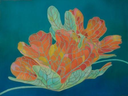
I didn't see this one coming but I ended up falling for a piece that didn't depict flames! It didn't suggest something other than flames to me either. I just really liked this particular shot of the bunched up cellophane. I decided to trust my instincts and to go in this new direction. Going with the flow and all... :-)

So what makes an image 'it'? When I create a still life, I am assessing images for things like overall statement, impact, flow, composition and interesting light patterns. At this stage I am asking 'What is the story I want to tell here?' 'What is this image saying to me? What is it about?' I am looking for an image that gives me something to work with. I then use the image as a base to work up from up. Once I start creating the drawing, I can adjust the image to create better flow, or to improve composition, etc.

Now that I had my reference photo, it was time for the next step, executing a drawing. I love drawing and capturing all of the lines and negative spaces amongst the shapes was delicious. Before I started, I needed to have an idea of how big to make the drawing. I took a sheet of 28" x 20" paper as my guideline and made my drawing smaller than that. No fancy tricks here at the drawing stage, just me, a pencil and paper.

Once I had a drawing that I liked, I copied it to a sheet of tracing paper. I could have done my original drawing on tracing paper but I don't like using this to create my drawings - I am not keen on the feel of the paper nor do I like erasing on it. Yet I do like the softness of the tracing paper for the transfering part.

The following photo shows me at the transfer stage. If you would like detailed step by step instructions on how to transfer an image to coloured paper, click here to go to the February 2009 edition of my Newsletter. Just scroll down to the question section.


Of course before I could start transferring, I needed to choose the paper. I knew I wanted to use a coloured ground for this work. I also wanted it to be a sanded surface. I got out all of the sheets of sanded pastel paper that I own that were in the right size and I looked for a colour that I thought would work. A blue sheet caught me attention. I decided to look for other colours at the art supply store. More shopping required. I brought home a few sheets of different colours to try. Using the edge of the papers, I tested several of the coloured pencils that I knew would be used in the dominant colours of the finished work. I was comparing how the pigment looked on the different coloured grounds. I ended up deciding on an eggplant coloured paper. Specifically the paper is Art Spectrum Colourfix Pastel Paper (a very permanent, lightfast, coated paper with what I find to be a delightful toothy surface).

In the photo below, you can see my drawing has been placed over the transfer paper and I am ready to transfer the drawing to my Colourfix paper.


Here is how the paper looks with my line drawing on it. For an idea of scale, my drawing is 23" x 14" (58cm x 36 cm).

My next post will show the remaining steps. From inspiration, to the photo shoot, to editing, to the drawing - finally the work was at the stage where I could get working with my cps!