Friday, September 26, 2014

wip update, yay for scribbling and boo to Prismacolor

Newsletter day for my TMS Newsletter Group...here is my usual Friday post offering up an excerpt:

I can’t believe it is Friday already! Tomorrow my CP Basics students return for another day of working their pencils. We had so much fun last Saturday that I can’t wait to have them here again.

This week I am sharing an update on my work in progress and I am sharing some of my dissatisfaction with Prismacolor. (Don’t you hate it when companies change things and not for the better?) I also have a great link to some awesome and very different coloured pencil art. You are going to want to check this out.

First up, I am going to show you how my mixed media piece turned out. In case you missed last week’s newsletter, here is how it looked in the beginning:


I worked on a sanded, coloured paper and along with my coloured pencils I also used Caran d’Ache’s Neocolors II, which are water soluble wax pastels (I used them dry and don’t be confused by the word pastel, they behave like oil pastels, not like chalky pastels - not trying to offend pastel users, I know they aren’t ‘chalk’ LOL and if you haven’t tried oil pastels, think of the crayons you used as a kid – that will give you the idea.)
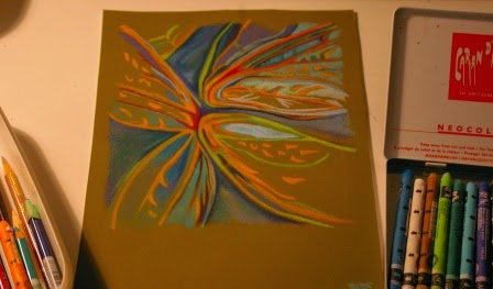
Here is how it looks now.


Coloured Pencil and Neocolors II, 6 ¾ inches x 7 ¼ inches, on Mi-Teintes Touch paper, copyright Teresa Mallen


As I mentioned last week, this sort of piece is just out and out fun. I play with simple shapes and lines, I use my favourite colours and I get to work quickly.

And now I am bored and I am craving a drawing challenge!

I know coloured pencil artists can get a tad militant about their favourite brand of pencil yet I like all sorts of brands. For working on sanded papers, I really like
Derwent Colorsoft pencils.Their leads are a bit thicker which works well for the sort of art that I tend to do on sanded paper, i.e. there is usually less depiction of detail. They are a ‘soft’ pencil yet they stand up well to a sanded surface (the pigment doesn’t flake off) and the colours look absolutely yummy, very rich. I used Derwent Colorsofts in this piece, along with the Neocolor II pastels.

___________________________________________________________________

Boo to Prismacolor:When teaching, I ask my students to bring Prismacolor pencils. They are readily available in North America which makes them easier for beginners to purchase. Ottawa doesn’t have a lot of selection when it comes to art supply stores so for other pencil brands such as Caran d’Ache’s Luminance, we have shop on-line.

Anyway, after last Saturday’s class, I have discovered a couple of unpleasant things about Prismacolor. First up, they are now selling their sets with already sharpened pencils. And yuck, they are doing a horrible job of sharpening. If you work in cps, you know how important the right pencil point is to achieving the best effects possible.

Prior to our first class, I sent my students an article I had written about how to care for their new pencils. I talked quite a bit about how important sharpeners were, what blades to look for etc. After all of that prep, these folks got saddled with badly sharpened pencils in their new pencil sets.

Prismacolor took off the cedar casing but they left a fat stub of a tip, pretty much a dull pencil. Very weird looking.
What if you didn’t have someone to tell you that such a stub is just not the way to work? Sheesh...

I thought it was bad back when Prismacolor included a pathetic little hand sharpener – which my students would unwittingly use, thinking that if the manufacturer included it, it must be the best sharpener for their new pencils. The right sharpener is soooo important! I could seriously start to rant here...

Second problem with Prismacolor, their 60 pencil set no longer contains the 48!
What???!!! How silly is this? To keep things as economical as possible, I only require the 48 pencil set for my CP Basics course. One student bought a larger set only to find that she was missing some of the 48 set pencils. Since when did Prismacolor decide that the larger sets should no longer build on the smaller sets? The 24 used to have the 12 set of pencils plus 12 more. The 48 used to contain the 24 set and then even more pencils and so on.

As we worked on our exercises, this student found that she didn’t have all of the pencils that were required yet she had a set that included 12 more pencils than the other students who had the 48 set. Grrrrr...

I shall be writing Prismacolor a letter of complaint.

Perhaps I should mention their ‘improved’ website. It is harder to navigate and you can no longer print off a simple colour chart of your pencil set which was handy for when you wanted to buy more pencils from open stock. You could see which pencils you already owned and then buy colours you didn’t have.
I noticed Derwent provides a downloadable PDF colour chart!

Seriously folks, how hard can it be for corporations to actually think of their customer’s needs? As a small biz owner, it is a major focus of my time and attention!

It can be so frustrating when changes like the ones mentioned above occur. I am still disappointed that my local art supply store decided to no longer carry Art Spectrum’s Colourfix paper – which is my favourite brand of sanded pastel paper.

So what do you do when your favourite art materials get changed on you and not for the better? FYI, stomping around the studio and muttering curse words under your breath doesn’t accomplish much. :-)


___________________________________________________________________

On a more cheery note, here is some art that will inspire you...

It is fresh and bright and how could anyone resist squiggly lines and oodles of scribbling?

In last week’s newsletter, I encouraged you to push the boundaries of what you comfortably do in your medium. This chap definitely works on the edge of what most people would be comfortable attempting with cps.


Here is a link to some seriously unique scribbling done in cps, by artist John Smolko:
http://www.smolkoart.com/ Do have a look around his gallery page. I think you will be impressed.

I was delighted to see an article John wrote about his process published in the October 2014 issue of ‘the Artist’s Magazine’. You can find it on newsstands now.

Here is a photo I took of art done by John Smolko at the
Colored Pencil Society of America’s International Exhibition, held in Atlanta, Georgia back in 2009.


This grainy pic gives you a sense of scale, of just how big John works. And (insert squeal) the picture on the top right is my Swiss Chard Mosaic. Yup, somebody pinch me.

"Art enables us to find ourselves and lose ourselves at the same time." Thomas Merton

Until next Friday, I hope you are super busy making some fun art – why not try scribbling?!

Friday, September 19, 2014

pushing past your boundaries


It's time for another newsletter! Woo-hoo :-) If you would like to join my newsletter group, just click here for a free subscription, no spam, I promise!
It has been a full week here in the studio. I have been cleaning and sorting the place, rearranging furniture and doing what is required to turn this awesome ‘room of my own’ into a teaching space.  My jungle of plants had to temporarily go, as well as my funky hanging basket chair.
I have wonderful cp enthusiasts arriving tomorrow morning to start my sweat shop/boot camp - Coloured Pencil Basics. (just a test to see if they are actually reading my newsletter, ha ha)

All I know is that when I am done this season of teaching, I am going to be wandering around wondering where I stored everything!

In the midst of all this, as I was procrastinating, I started a small mixed media piece. As I worked, I was thinking about how surprised people are when they see what can be done with coloured pencils.

That is the topic of this week’s newsletter, this notion of our mediums having limits and boundaries.
Have you pushed the limits and boundaries of your favourite medium? If you haven’t, maybe this should become a part of your regular art making time!

If you work in acrylic you know that it can be used in ways such that the results resemble oil paintings or watercolours. But did you know that there are all sorts of various media – from gels, pastes to crushed stone etc. that can be added into your art? Just check out Golden’s website to have a look at the goodies they offer, www.goldenpaints.com.

If you love watercolour paint, have you tried working with YUPO (a very unique, synthetic, waterproof, artist grade paper)? Google YUPO and be wowed by the fabulous images that come up. You can also use gouache and inks on it.

I am not suggesting that traditional ways of working have to get chucked. I would never advocate that. In fact I love the simplicity of working pure (just pencil and paper). So, of course you don’t have to work all of the time with gels and YUPO paper or move into adding markers, or work in collage.
BUT, what I am saying is that stretching past the boundaries you have with your medium will give you some fun thrills, seriously. Besides, exploration is a vital part of making sure our creative waters don’t become stagnant.
As for coloured pencils, well they can do an awful lot that most people don’t expect. You can dissolve or melt the wax binders (wax based pencils vs. oil) with solvents or heat to create art that looks it was done with oil paint. You can work on coloured sanded pastel paper to create art that resembles pastel. You can work over watercolour, on canvas, on wood, even gourds.

Down below is a sneak peek at my current work in progress. The colours are a bit off due to the lighting. It was raining outside so I made due with snapping a pic in the studio. The colours are brighter and more intense in real life. 

This is a departure for me in that I almost always (like 99% of the time) choose to work exclusively in cps. This time I am also using Caran D’Ache’s Neocolors II. Woo-hoo!

You can see them on the right hand side of the photo. These are water soluble wax pastels if you aren’t familiar with them. I am using them dry.

As you can also see, I am working on a coloured piece of paper, a sanded pastel paper.

I am using the pencils and the wax pastels interchangeably, as I build up my colours. They work very well together, one on top of the other. The image is about 7 inches by 8 inches.


You might be asking what the heck is this?

It is an abstract exploration of line, colour and pattern inspired in some way by the juncture of flower petals (hydrangea leaves). Also, as I work, I am ‘seeing’ something that makes me think of butter fly wings. In the end it isn’t meant to represent either petals or wings but this is my mental hook up at the moment.

For those of you who are familiar with my realistic botanicals, this is what I do in between those works. These sorts of pieces can get finished faster, are very creative for me and are a bit of a palate cleanse. I don’t have the time right now to dedicate myself to a large, detailed drawing and something like this is just out and out fun.

At this point I already know that some of this isn’t working well and a section was later erased and some lines changed direction. When I reached this stage, I hit the pause button. I was working very quickly and I needed to step back and actually look at the work critically. It was time to assess the composition and my intent for the patterns and colours.

I love this stage. I will post a work in my studio, somewhere where I can see it easily. I look at it, study it, analyze it, and I also set it free in my subconscious for my brain to keep on musing upon it even while I do other things.

I have worked on it a bit more and I shall continue to keep you posted on what becomes of this mixed media piece.

If you would like to view coloured pencil art in which other media is used, check out this link:  http://www.cpsa.org/view-explore-this-10.

The Coloured Pencil Society of America (a fabulous organization by the way, and did you know I earned signature status with the CPSA some years ago? Toot, toot! – that’s me tooting my own horn J) holds an annual on-line exhibition in which artists can submit mixed media work. (I haven’t entered this one yet, I have only entered their exclusively cp exhibitions.)

The works juried into the mixed media exhibition are posted in an on-line gallery – which is what the link I gave you above shows. (The cp only exhibition is hosted in a physical gallery and is not posted on-line, so you won’t find it on the website).

If you need to bust some of your assumptions about the limits of your medium, look around to see what others are doing. Look on-line, in art magazines and in galleries. Stretch yourself. Dare to try something you haven’t done before. You can always go back to your regular way of working later. This isn’t about forcing you to give up what you love. In fact, whenever I wander off to play in any other medium besides cps, I get fed up quite quickly and I go running back to my cps. That is why my adventures usually include cps! J

This exploration would make a fun artist’s date. Nudge, nudge...Are you ready to step outside your comfort zone and your limitations? Let loose a bit, play. If your new work looks goofy, no one has to see it. The point is to push those boundaries out, even just a bit. Come on...you can do it...


signs of autumn in the forest

Friday, September 12, 2014

simple, easy, DIY light box substitute

Excerpt from my September 13, 2014 Friday Newsletter, sent out to my Newsletter Group peeps :-)

It has been a week of highlights and being high, high on inspiration that is! My husband and I were in our usual seats on Monday night, front row, center, for Opera Lyra’s production of Puccini’s Tosca. It was spectacular and then some. I could go on and on about how amazing this particular tenor was (davidpomeroy.com) but in case you aren’t a fan of live opera, I will go back to the inspiration bit – excellence of any kind gives me chills.

When I am confronted with what a human can do it fires me up like not much else. These highly trained singers and the members of the National Arts Centre Orchestra have spent years practicing, studying and honing their skills.

We are capable of so much when we dedicate ourselves to something.

I so look forward to events like this as I always come home energized and more motivated to become the best artist I can be. Woo-hoo!

Another highlight of my week (and there have been several unexpected blessings in recent days) is that my tomato plants are ripening! J I declared it quitting time yesterday at 4:00. I couldn’t stay indoors any longer. We had a strong, cool breeze which meant no bugs. I poured a large glass of red wine and headed for the garden.

The abundance of the harvest is enough to make me swoon this time of year. (Could also be all of that wine my husband makes LOL, he has an Autumn ritual of crushing and pressing ripe grapes shipped from California to Ottawa’s “Little Italy” and eventually our root cellar becomes a wine cellar, I rush to add I am drinking last year’s aged wine. J)

 
In about 10 minutes I had my first large basket picked. All of my plants were started from seed and put under grow lights last February, deep in the midst of winter. Patience is eventually rewarded!
I hope you all have had an incredible week – wasn’t the moonlight a few days ago incredible?! Wow.

Well I could go on but I had better get down to business here and make good on my promise. Last week I shared that this issue would give you instructions on how to make a simple DIY light box – no nails, screws, carpenter’s glue and no power tools.

Backing up a bit, you might remember that a couple of weeks ago I described the various methods used to transfer a drawing to ‘good’ paper. One of the methods, the illumination method, involves using a window or a light box. This is my preferred transfer method.
A window works very well, but tracing a detailed drawing standing up, working completely vertical on your paper, can be tiring for your hands, arms and legs.

Yet a decent sized light box can be difficult to find and they cost quite a bit.
So here is something that is not really a light box, but works very well.

 
My Light Box Substitute:

You need just two items!

My ‘light box’ (which doesn’t actually have a box) consists of a length of fluorescent tubing and a large sheet of acrylic ‘glass’ (perhaps you are familiar with the brand name Plexiglas, that is the sort of thing I mean).

You can put this together for as little as $25.00 or $30.00, depending on the size of the acrylic you buy. I bought my acrylic sheeting at Home Depot. They have a variety of sizes and I understand they will even cut a size for you. Ask a salesperson at your local hardware store for help.

Please note that some acrylic ‘glass’ is sturdier that others and will cost a bit more. For example I saw some very stiff stuff labeled high impact glass.

I recommend paying a bit more. You don’t want a sheet that is too flexible. Buy one that is stiff enough to take the pressure of you transferring the drawing. Remember that you might be leaning your arms on it while you work. You don’t want it so flexible that it moves up and down easily.

Even though the product is referred to as glass, please note that this is a plastic product. The edges are not sharp like glass, it isn't heavy like glass and it isn't fragile like glass either. Just be mindful that it does scratch pretty easily.
Here is a picture of my set up:


When I want to use the ‘light box’, I place the fluorescent tubing on a table and then I place the sheet of thick acrylic over top of it. I rest the acrylic sheet right on top of the tubing.

My drawing is positioned over the light. I tape my sketch onto the acrylic glass, I cover it with my paper, turn on my light and I am good to go.


Advantages of this light box:
  • This 'light box' is custom made to suit your needs - you choose the length of light tubing and acrylic that works best for you.
  • It is super easy to store as it consists of just two parts and each can be stored upright in a closet.
  • It is much, much cheaper than buying a regular light box.
  • You can use the acrylic glass for other purposes. I use mine as a work surface when I am on the road with my art and also as a lap table for when I leave my studio and choose to work in a chair in the living room...sometimes it is nice to sit by the fire on a cold winter's night. J

Of course if you would like a woodworking project, you could create a frame, i.e. an actual box.

You could also buy another light tube to add further light which would be helpful if your drawings are large. Simply place the acrylic overtop of both tubes. When I worked on large drawing, I simply moved my drawing around.

TIP: Do you know any health care workers, lab technicians or hospital custodians?
It wouldn’t have occurred to me that this might be a source for getting a free light box but here is my story. Last year I was given a proper light box! (Actually I was given two but one has a cord that needs rewiring so it doesn’t work at the moment.)

They were destined for land fill. My sister in law’s husband is a medical photographer and works in a hospital. These old light boxes were used by doctors to view x rays. Photographers also used them to view slides and negatives. Of course technology has changed a lot and these light boxes were no longer being used. They were getting disposed of. Why not get the word out to someone working in a hospital or clinic to see if they have some unwanted light boxes gathering dust in a storage room? You might get very lucky!

___________________________________________________________________
CLASSES UPDATE:

The Coloured Pencil Basics course that starts on the 20th is full. In fact registration is now closed on all of my fall courses/workshops. A huge thank you goes out to all of you that signed up!

If you would like to be put on a waiting list, should a cancellation occur, simply email me. Thank you for your interest!

___________________________________________________________________

 Go soak up some inspiration of your own this coming week and perhaps pause to enjoy a glass of wine. Ponder growing some tomatoes next summer (they can grow in containers on a patio or balcony). Nothing tastes like ‘em!

But most importantly, make some art, go on an artist’s date, visit an exhibit...

Friday, September 5, 2014

let's celebrate our unique wiring to create art

Newsletter Friday...here is September 5th's excerpt...

This week I am pondering our unique brand of weirdness. I hope you will join me in my musings (and in a celebration)...cause seriously, do you ever wonder why you? Why you have the desire to make art?
Maybe you are like me and no one in your family (and I mean no one, not parents, sibling, aunts, uncles or oodles of cousins) has had any desire to seriously pursue drawing or painting.

So why us? Why this compulsion that won’t be ignored?
This week I have been emailing info to my students. I have been sending out the supplies list, maps to my studio and registration receipts. While doing this I found myself getting excited. I am excited for these people and what they are embarking upon.

I wondered yet again what motivates people to offer up hard earned money and move their bodies across the city (sometimes further) to take a coloured pencil course or workshop.

For the most part, these are not aspiring professionals wanting to hone their skills but folks with careers in other lines of work. I used to think that art was just a hobby for them and a group class was a safe bet for some entertainment and relaxation.

Now I am not so sure.

I suspect there is a deeper, more fundamental motivation that drives us to want to learn how to draw, colour or paint.

Perhaps what motivates my students to be present is related to that ancient need to create, apart from the other activities in their lives. There is something essential in the act of creation, or in simply learning to create, that answers this need.

In fact one student has shared that the reason she loves taking classes is that she absolutely loves learning how. This is what gives her immense joy. (and coloured pencil is apparently her last medium left to learn the how of, and boy do I have the course for her, I am going to love rocking her world. LOL)
 

   some students suddenly looking very busy, heads down working away – cause the camera has come out, LOL

“Learning never exhausts the mind.” Leonardo da Vinci
I take my role as a teacher seriously, very seriously. I deeply value the trust my students place in me – they come with their hopes and dreams, with their fears and insecurities and they really hope that I will deliver - that I will offer up the instruction they need and that I will create an environment of learning that is fun and supportive.

Uncaring, lazy art teachers do exist and so do terrible courses. Even if coloured pencil doesn’t end up being their favourite medium (not sure how that could happen J) they should go away having had a great time, having learned an awful lot and still be inspired to keep on creating.
I have had my own art teacher/course from hell experience. Seriously, it was so bad that when I finished the course (it was a basic watercolour class), I put all of my art supplies away. I was convinced art wasn’t for me. Fortunately a year later I came to my senses and pulled myself up by my bootstraps and started teaching myself to draw and colour in spite of that horrible teacher and that horrible three month experience.

Please don’t ever let a bad art experience stop you!
So perhaps my role is more than teaching people all sorts of useful and necessary techniques.

What if my job is also facilitating a connection with this real reason they are present, the universal fundamental desire to create?
Woo-hoo, that steps up my game a notch! I love it.


 It is this love of creation that brings us all together. It is why you are reading this newsletter.

 So this week, please let me encourage you to celebrate this uniquely weird thing about you. You love to draw, to paint?! Then by gosh go do some drawing or painting.

 Create...explore. And savour the knowing that there is a tribe of like minded souls, hard wired just like you that are also creating just for the sheer love it.

 Why not us? I for one am very grateful for my unique brand of weirdness. J

And if you work in coloured pencil and you love drawing all sorts of detail, well, let me just say that you are a super sort of weird and a super sort of wonderful!!!!

If you want to share your thoughts on being gifted with this desire to make art, I would love to hear from you.  What are you going to do to celebrate your unique brand of weirdness?

Here is a sneak peek at next week’s newsletter – I shall be sharing instructions on how to put together a very inexpensive light box. No screws or nails, no power tools, I promise!

___________________________________________________________________

Last call: If you have been away on vacation, living under a rock or gasp not reading my newsletters this summer AND you want to join us for the CP Basics class starting on the 20th, check out the details and register ASAP, here’s the link: