I was teaching a class here, in my studio, on Halloween a few
years ago. I donned a special hat to greet my students. J I remember that the pumpkin was surprisingly heavy – hurry
up and take the picture. LOL
The Challenges of
Colourful Art
This week I am responding to a question from a reader that is
struggling with super colourful subject matter (she wishes to remain anonymous).
Specifically, she has been working on some landscape sketches and drawings this
fall and she is feeling a bit overwhelmed by the foliage colours. She thinks
her efforts are garish.
Her question was if I had any advice on how she could approach
fall foliage.
This is a great question and it doesn't just apply to fall
foliage. Colourful subject matter, whether depicting a busy market of vendors selling
astonishing fabrics, rugs and colourful jewelry or perhaps a garden scene
filled with brightly coloured flowers offers up some unique challenges.
Here are my
suggestions for embracing colourful challenges:
1) Simply embrace the colour, in all of its boldness and
brightness. Just go ahead and depict it. Turn off the voice in your head that
judges the work as garish. Sit with the piece for a while. Before making any
changes, see if the colours might start to grow on you.
2) If you think that all of the bright colour is creating a
chaotic mess, make sure you have established a focal point. Give the viewer’s
eyes a place to enter the picture and compose it in such a way that there is a
path to visually travel around the scene. For example, if creating a landscape,
chose a particular tree or small grove of colourful trees as your focal point.
Place your brightest colours here. Subdue other areas as needed or soften the
edges of adjacent trees.
3) You can adjust the intensity of the piece by deliberately
toning down the bright areas. Try dulling down some of the super bright areas
that are not your focal point. Fortunately it is always easier to dull down a
bright area rather than brighten up something you have already made dull, so work bright first.
4) You can make the areas that are in strong light the
brightest and dull down the areas in shadow. When viewing a scene, it is harder
for our eyes to see bright colour in shaded areas so simply reflect this fact
in your art.
5) Limit your palette. If you are feeling compelled to throw
in every colour in your pencil box, rethink this. A great way to get control of
your colour is to limit yourself to fewer pencils or pastel sticks, etc. You
will create with better colour harmony and the piece will have a more natural
flow.
6) You do not have to depict everything you see. Edit out
some of the colour variations (there are an awful lot of them in fall foliage).
Try limiting the colours you create and not just the pencils you use.
7) Have a look at how other artists handle brightly coloured
scenes. You may be surprised at what you see. Many contemporary artists work
very bright and bold, unapologetically so. Years ago their work would have
seemed unskilled and ugly. Today our minds are more used to busy images.
Below is a picture of one of my favourite paintings, Tangled
Garden by J.E.H.
MacDonald completed in 1916, (if you are ever in Ottawa, the original
is hanging in our National Gallery. I urge you to go see it, as well as all
other works by the Group of Seven).
At first glance it can seem a busy, chaotic garden mess
but look at it long enough and it becomes a visual feast.
This is an example of a painting that can be immediately
overwhelming, creating a desire to look elsewhere. But, if you really examine
the image you can start to make sense of it all.
Obviously there is a lot going on with regards to all of
the blossoms and plants but you can see that MacDonald has controlled his use
of colour carefully. There is an amazing amount of colour harmony going on here.
Try and imagine the impact of Tangled Garden if you could
see it full size – 47.8 inches x 60
inches (121.4 cm x 152.4 cm).
(with regards to copyright, this image is now in the
public domain)
Bottom line, don’t be
afraid of colour. Explore. Experiment.
As long as you are
drawing or painting, it is all good! :-)
This was a great question and I hope my ideas are helpful.
If you have something that you would like my ‘two cents’ on,
just send me an email.
______________________________________________________
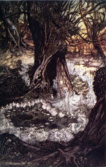
Anyone else out there love the spooky art of illustration legend
Arthur Rackham?!!! I have a book on his life and this week I have been delighting
in revisiting his brilliant work. Such a master of drawing and such gorgeous
use of line! His work is definitely
appropriate for Halloween.

Rackham, Fairy Ring, public domain
You are going to have to look closely in order to see the faces
and fairies. I suggest you look for examples of his work on the internet or
look for work he illustrated at your local library. I am a huge fan of Rackham
trees! :-)


No comments:
Post a Comment